

Tio Gazpacho
How do you create a visual identity for a startup brand of portable, drinkable soups - a category most retailers weren't even aware of.
I started with the packaging, which had to stand out on the shelves given how few knew to look for the product. This being gazpacho, I used bold colors.
We then gave the labels a witty personality that rewards the consumer for taking the time to read it.

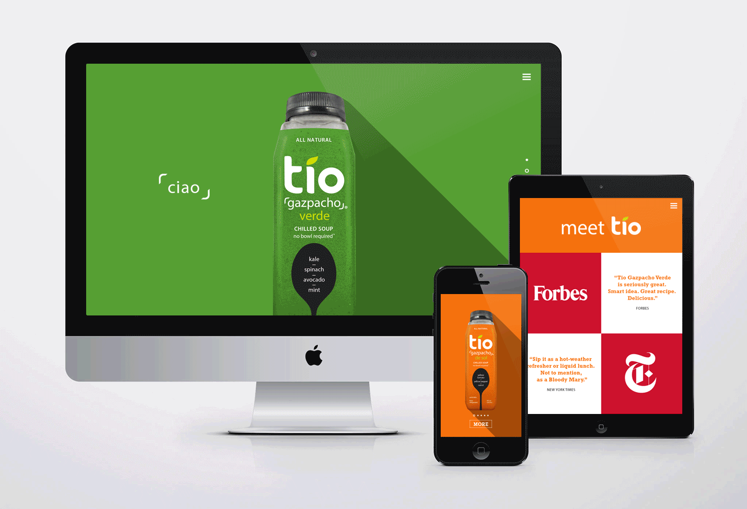
We extended this philosophy to Tio's website and digital presence, using simplicity and color to create a splash.
The product has since been picked up by Whole Foods, Amazon and specialty grocers nationwide.